Avoid 3D charts, extend bar charts to zero & other key tips
Target audience: Data designers, metrics and analytics experts, nonprofits, cause organizations, foundations, NGOs, social enterprises, businesses, educators, journalists, general public.
Guest post by Beth Kanter
Beth’s Blog
 Earlier this year at the Packard Foundation, I facilitated a peer learning group based on my book Measuring the Networked Nonprofit and focusing on the sense-making step of measurement.
This part of the measurement process is most the fun because it covers visualization, pattern recognition, and reflection. I wanted to take a deeper dive into resources out there that provide useful tips about how to do this step for folks who were not data scientists or data nerds.
I did a quick scan of data visualization resources to look for practical advice on the process of thinking visually and some technical information on what chart to select and data storytelling. Here’s what I discovered.
1Data Visualization Survival Guide: This resource (including the 176-slide deck at top) was suggested by Devon Smith. The deck was part of a workshop facilitated by Gregor Aisch, who combines data visualization, information design, and journalism in his work. The deck provides specific practical advice on charts, color, and maps. I like the chart advice:
- Avoid 3D charts at all costs. The perspective distorts the data, what is displayed ‘in front’ is perceived as more important than what is shown in the background.
- Use pie charts with care, and only to show part of whole relationships. Two is the ideal number of slices, but never show more than five. Don’t use pie charts if you want to compare values (use bar charts instead).
- Always extend bar charts to zero baseline. Order bars by value to make comparison easier.
- Use line charts to show time series data. That’s simply the best way to show how a variable changes over time.
- Avoid stacked area charts, they are easily mis-interpreted.
- Go with direct labeling wherever possible. You can safe your readers a lot time by placing labels directly onto the visual elements instead of collecting them in a separate legend. Also remind that we cannot differentiate that much colors.
- Label your axes! You might think that’s kind of obvious, but still it happens quite often that designers and journalists simply forget to label the axes.
- Tell readers why they should care about your graphic. Don’t waste the title line by just saying what data is shown.
2The Functional Art: This is the title of a book by Alberto Cairo who also teaches infographics at the University of Miami. I discovered him through Upwell’s shark lover, Rachel Dearborn. You can get a quick overview of the ideas in the book from the deck above (and listen to a recent lecture), but I definitely need to read this book. His approach is less about the drawing part of information design and data visualization, but the thinking part. How do you think visually? How do you tell stories with data?

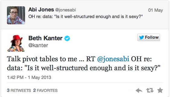
3How To Tell Stories With Data: This is a deck from Edward Segal that combines the best practices of storytelling narrative with data visualization. The slides that resonated with me were the principles (slides 19-29), but especially like the advice in Slide 26 (above) about “sexy charts.” I found this from a very well curated list of data storytelling resources that will require a deeper dive another day.

4Data for Radicals: My longtime colleague and friend, Lisa Williams, is working on a book about data visualization for beginners. I’m looking forward to the book!
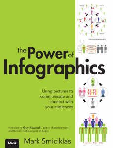
5The Power of Infographics by Mark Smiciklas. Chapter 11 has a simple and clear visual guide to selecting key shapes, icons, symbols, graphics, and charts to communicate data visually. I like the simplicity. But, I wanted to go a little deeper on how to decide which chart format is best — and found this useful piece.
6Data Points that Mean Something by Nathan Yau – The process of creating meaningful data visualizations means combining the skills of a designer, statistician, and storyteller. The author writes the flowing data blog. The book has a section about exploring data visually and the process. He suggests asking these questions:
- What data do you have?
- What do you want to know about it?
- What visualization methods should you use?
- What do you see and does it make sense?
He makes a good point that to avoid “drowning” in data, learn to swim in the shallow end of it and work you way towards the deep end. The key is to come up with some questions, particularly from the point of view of the reader or audience. On his blog, he has a good list of tips for selecting the right chart and graph and making sense of the data – “Basic Rules for Making Charts and Graphs.” The book also has a useful guide to detecting patterns in your data: Increase, Decrease, Combination, Outlier, Noise. And the way to communicate those patterns visually: position, length, angle, direction, area, volume, and color.
What are your favorite resources for data visualization for nonprofits?
 This work is licensed under a Creative Commons Attribution 3.0 Unported.


