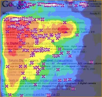
A heat map can show where visitors are clicking on your landing page.
 I’ve been doing a lot of work/research about improving landing pages on nonprofit websites.
What’s a landing page and why should you care?
A landing page is a page on your website where you want visitors to complete a specific transaction, such as donating money or joining an email list.
Obviously these are some of the most important pages on your website. In Seth Godin’s words, “Landing pages are the new direct marketing, and everyone with a website is a direct marketer.”
As you can imagine, this is always harder than it sounds. Bad design, uninspiring text, and slow load times are just a few challenges. Below are tips that can help you improve the results on your landing pages:
Before you create your landing pages
- Know your audience. Understand that their motivations are often different from yours.
- What’s your goal? Pick one, and only one.
- Who’s your audience? It’s tempting to think that your landing page needs to engage all of your audiences. But if you try and create a message that speaks to everyone, all you’ll end up doing is inspiring no one.
- What’s your story? Pick one.
Designing and writing landing pages
- Maintain the same branding on all landing pages. On your Facebook custom tab and avatar, in your email newsletter template, and in your direct mail pieces.
- Use white space to direct the eye. White space at the margins will tend to direct your visitor to the center of the page.

- Use a paragraph break every two sentences. No one reads the text on landing pages, they scan it. Then, if they’re interested, they’ll read more closely.
- Use bullet points and numbered items. Bullet points are extremely humble little creatures. But they subconsciously convey two powerful messages: “You will be getting several things here” and “These things are very specific.”
- Use big fonts. A study conducted by Stamford University confirmed that font size influences trust. 16 is the new 14.
- Use big buttons. Amnesty International found that bigger donation buttons help convert more donors.
- Focus attention with a compelling and concise headline that states the outcome. Malaria No More does this very well.
- Optimize your landing page for search engines. Guess who owns the top spot for “Donate Now”? Network for Good.
- Write copy in second person narrative. The word “you” (second-person pronoun) directly addresses the reader, and makes the landing page 100% about them.
- Have only one call to action, but repeat it two or three times. Visitors want to be told what to do – just tell them!
- Focus attention with a compelling image – preferably a person. Are the thousand words on your landing page telling people to go elsewhere?
- Spend the money on licensing a professionally shot photograph. Good sources for these images are Fotolia and Getty Images.
- Use fewer words. Only focus on story and call to action. A good exercise is to take your existing copy and cut it in half. Chances are you’ll end up with a much more effective landing page.
- Keep the important stuff above the fold (area of the browser that’s visible without scrolling down).
Improving functions within landing pages
- Reduce clutter. Again, what one thing do you want them to do? If you’re using WordPress for your website, a theme like Headway even allows you to eliminate the navigation bar on landing pages.
- Ditch the sidebars. Unless the information in the sidebar contributes to the landing page, get rid of them!
- Ditch the pop-ups. If you find them annoying, why wouldn’t your constituents?
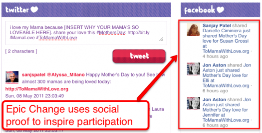
- Leverage social proof. People will be more likely to act if they see others doing the same. Check out ToMamaWithLove for a great example.

- Reduce page load times. People start to drop off if your page takes longer that 2 seconds to load. Use Google Page Speed.
- Get more out of your thank you page. Your cause is top of mind for people when they donate or sign a petition. Use that moment to get them to take another action (share, join an email list or text message list, etc.).
Measuring landing page results
- Measuring will answer these questions:
- Where do people arrive from?
- Where do they exit?
- Which inner pages point to the landing Page?
- How long do they stay?
- What other Pages did they visit?
- Which social media sites send us the most traffic?
- How are they finding us in search?
Check out these video tutorials on using Google Analytics.
- Use heat maps (see above). They will show you where people are clicking most on your landing page.
- Perform the three second rule:
- Have a few people look at your landing page for three seconds.
- Close the browser and have them write down the purpose of the page was.
- You’ll be very surprised at their response.
- Perform the “Header Removal Test.“ If you remove the logo and tagline from your website, will people still know what your site is about without scrolling?
Debrief and discuss your results
- Data means nothing if there’s no discussion about its meaning and how you’ll respond to what you’ve learned.
What’s your tip for landing pages? Share below
Related
• See our Facebook tutorials (Socialbrite)John Haydon delivers social web strategy solutions for “the quick, the smart, and the slightly manic.” Curious? Then visit the John Haydon blog, follow him on Twitter or leave a comment.
 This work is licensed under a Creative Commons Attribution-NonCommercial 3.0 Unported.


