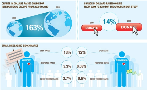
Infographics & data visualization turn data into stories
Guest post by Julia Reich
Principal & Creative Director, Julia Reich Design
 Most organizations have important data to present to their clients, members, boards of directors and other constituencies. Yet who has time to read or understand the reports, charts and diagrams created by your overworked staff?
Infographics are a communication trend that’s all about displaying data in an attractive, easily digestible format. With their unique combination of images and words, infographics are a powerful storytelling tool. It’s a way to take all that data you’ve collected about the great things your organization does and use it for social good purposes – to illustrate timelines, histories, relationships, the impact of a program and much more.
Removing a barrier to understanding
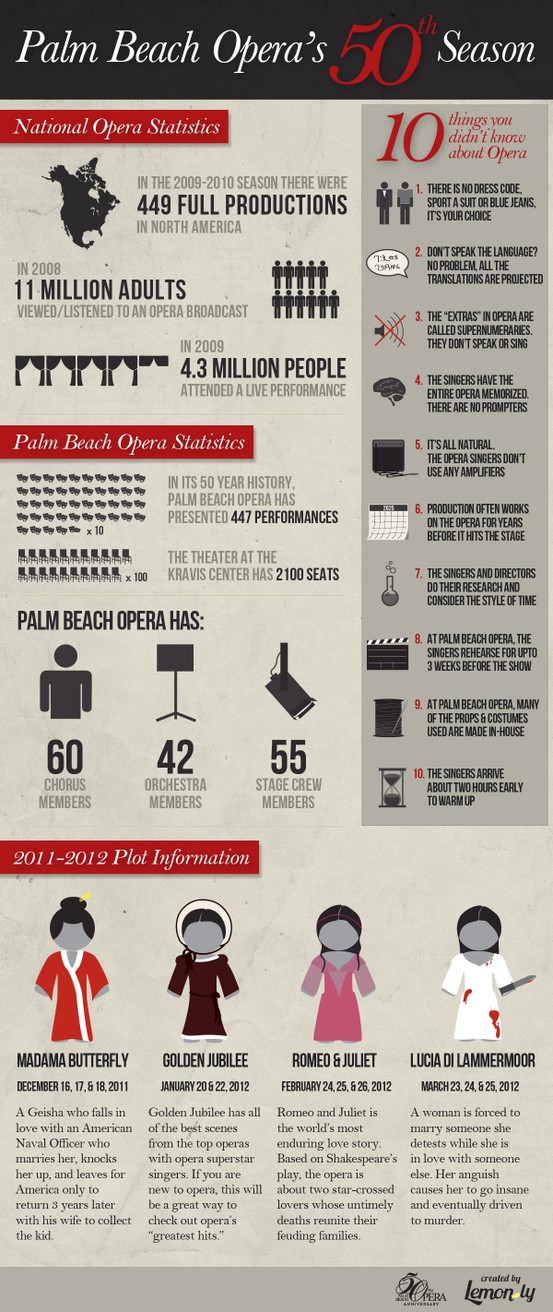
Ceci Dadisman, the director of marketing and public relations at Palm Beach Opera in West Palm Beach, Fla., used an infographic to promote her group’s 50th Anniversary Season. She says, “Opera, ballet and symphony are such complicated art forms. We are always trying to explain it simply in a nonthreatening way. Infographics are a good way to explain what opera is with some facts anyone could understand.”
Jeff Ferzoco should know. As the creative and technology director at Regional Plan Association in New York – an 85-year-old advocacy group focused on urban research and planning in the tri-state area – it’s his team’s job to sift through mountains of data and figure out the best way to arm policy-makers and citizens with the knowledge they need to move the conversation forward about a particular project.
“Busy people don’t want to spend too much time to unravel complicated information, so if it’s explained at a level that’s instantly understandable and emotionally satisfying, you’ll have a lot more success getting your message across. It removes a barrier to understanding,” he says.
Infographics for reports, newsletters, videos, blog posts
Nonprofits are using infographics in a multitude of ways, such as in reports, newsletters, with a blog post, or in a video.
The marketing team at Open Arms, based in Minneapolis – an organization that cooks and delivers free meals for individuals too ill to provide for their own nutritional needs – created several infographics last year for their 2010 annual report.
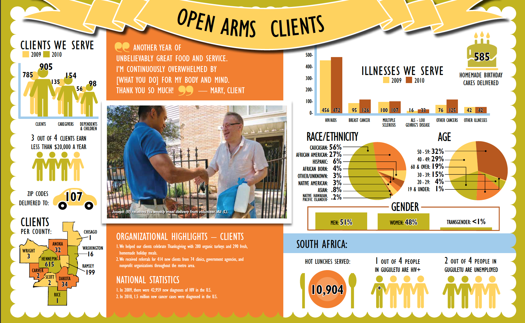
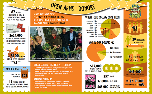
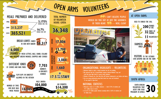
Kelly McManus is creative director at Open Arms and Susan Pagani is the Communications Director. They say that scattering the report with several infographics was a strategic decision they made together. “We wanted it to be more accessible to everyone – not just those who read the entire report cover to cover. Before, it was onerous to read. This has brought a level of fun to it.”
Kelly and Susan state they made the annual report more engaging by mixing up the serious statistics that are required to be reported, with more quirky facts – such as how many cookies were baked. This warm, welcoming approach reinforces their brand as well.
How to get started when creating an infographic
To begin an infographic project, it’s important to determine at the outset what your overall goals are, who your audiences are and what message you want to convey. Find the story you want to tell with graphics, and mine your data to locate the facts that support that idea. You will also need to provide text that accompanies the graphics, such as headlines and conclusions.
McManus supports this idea. “Infographics are a team effort. We got started by creating an outline on what messages we wanted to convey and those certain things you have to report on as an NPO, and then there are things we bring in to warm it up in a way our audience would find inspiring. We worked together with different departments to obtain the statistics we needed. Finally, we sketched it out and started creating designs.”
Infographics as a way to boost your site’s SEO
The more compelling the information in your infographic, the more people are likely to share it, like it, mention it – so more traffic gets driven to that page, thereby boosting your page rankings.
By promoting your piece thoughtfully, you can increase the likelihood of this happening:
- Optimize with keywords: “Bots” can’t read the text in your graphic (typically a jpeg or png file), but any image inserted on a site can be optimized by adding a title, 3-5 sentence introduction, and “alt text” (that’s text you see in lieu of an image on a site if the image loads slowly) into the HTML code. Use the word “Infographic” in the title. The actual file name should be keyword-rich too (rather than some file naming convention you may use internally). Tip: Google *can* read content in a PDF, so consider posting an alternative file your audience can download.
- Incoming traffic: Since they are easily shared via email and social networks, infographics drive people back to your site to see the graphic in context to possibly learn more, or get a better, larger view of it. Make it easy for users to share the piece by adding the following buttons: Twitter, Facebook Like, Google +1 and StumbleUpon.
- Time spent: An informative piece on a topic with wide appeal makes a Web page more interesting, so visitors are more apt to spend time on that page – and that’s a good thing, according to Google’s ever-shifting page-ranking algorithm.
Measuring efficacy is tricky business
The nonprofit marketeers and designers I talked with agree that measuring an infographic’s success is difficult. Instead, Dadisman has a different set of expectations: “We knew we weren’t going to get direct ticket sales from it; it’s more of a mission to further our presence in the community and about opera in general.” She admits, “It’s hard to measure ROI. The evidence is anecedotal. It’s more of a long-term effort to build brand awareness. We can watch the infographic make its way around the internet with very little effort after the initial posting, so we know people are sharing it and spreading the word.”
At Open Arms, McManus and Pagani agree. “Donations went up last year but we can’t pin it directly to our infographic efforts. We hear a lot of comments – people from other organizations are using the infographics we created to show their own nonprofit how to convey information for donors and volunteers in a way that hasn’t been done before.”
The value of data visualization
The ubiquity of mobile devices means more and more data streams are flowing all around us, with a need for that information to be processed, delivered and understood. And with people becoming more design-savvy over time, there’s a demand for visual clarity and accessibility. Infographics are a tool that can use data in an attractive and engaging way to provide value to your organization.
Dadisman appreciates the impact infographics have had on her marketing efforts and plans to create more in the future. “It is the vernacular right now. Most people are visual learners. The arts are perfect for this form of communication.”
Especially for nonprofits, McManus and Pagani concur that “Infographics make it possible to tell a complex story in a few words that people can grasp right away. They’re great for nonprofits to tell a story that will resonate with your audience. Telling people their dimes are being put to good worth – that is the ultimate value.”
Julia Reich is the principal and creative director of Julia Reich Design, a design and branding firm for nonprofit organizations, progressive businesses and educational institutions based in central New York state. This article originally appeared on the NTEN blog and we thought it rocked!
 This work is licensed under a Creative Commons Attribution-NonCommercial 3.0 Unported.


