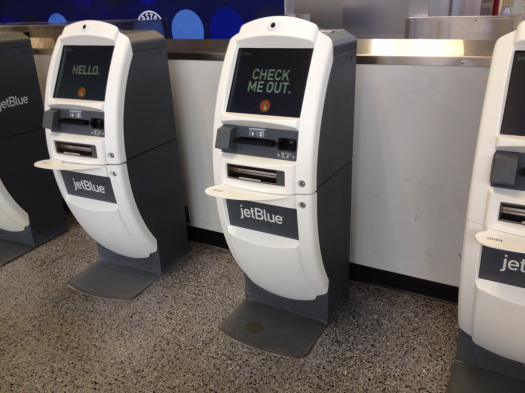
Keeping your donate pages simple and foolproof, like the airline’s kiosks, is the name of the game
Target audience: Nonprofits, cause organizations, foundations, NGOs, social enterprises, general public.
 All nonprofit marketers should fly JetBlue at least once. Just to use the check-in kiosks. If you’re not familiar with them, take a look at the one shown above.
Most of us hate the check-in process at the airport. The mixed up flights and delays. Making sure your bottles of hair products and lotions are all in order. And TSA guards, although I find them pleasant most of the time.
JetBlue isn’t going to change the TSA, but they have made make the check-in process painless!
1. No needless info: The welcome screen tells you exactly what to do (swipe your credit card or enter a confirmation number). They don’t describe every step you’ll need to go through, just the step you need to know right then.
Are your donation pages overcomplicating things with needless information?
2. Actions are highlighted: Required screen touches are clearly marked out in a contrasting color.
Side note: Don’t go changing your donation buttons to green. They probably picked green because it can be seen easier in a bright area like an airport.
3. Hurdles are removed: JetBlue makes its check-in process as painless as possible. Customers go from swiping their credit card to getting their boarding passes in just a few screens.
4. Designed for the rule, not the exception: They understand that most of their passengers don’t transport hazardous materials. So on the screen asking whether you’re carrying any, “NO” is highlighted in green.
Don’t force people to opt into things unless it makes sense for them or applies to the majority.
5. Timely upsells: Who pays $20 for baggage when you’re buying an airline ticket online?
You haven’t packed yet, so you don’t know how many bags you have. And you haven’t carried them 10 minutes from where you parked your car, or got dropped off.
Right when you feel the most pain, you’re prompted (at the kiosk) to remove it for $20. Because you’ve entered your credit card to locate your tickets, checking in a bag for $20 is two screen touches.
What else can you think of? Tell us below!John Haydon delivers social web strategy solutions for “the quick, the smart, and the slightly manic.” Curious? Then visit the John Haydon blog, follow him on Twitter or leave a comment.
 This work is licensed under a Creative Commons Attribution-NonCommercial 3.0 Unported.


Nice
read! Very informative. Check this article: Nestlé: Playing Emerging Markets
Through Western Blue-Chips. Read it here: http://bit.ly/1mGJ0vu
The welcome screen tells you exactly what to do (swipe your credit card or enter a confirmation number). They don’t describe every step you’ll need to go through, just the step you need to know right then. http://qr.net/sqr6
in this post we are get and like as you are fundraising tips and you can lean by the many of place Many of us detest that check-in method in the international airport. That mixed up flights in addition to delays. By ensuring your own containers connected with curly hair products in addition to products tend to be all if you want.
Thanks……………….
Social BookMarking site
Great tips! Love the comparison between JetBlue and nonprofits – really goes to show how all industries can learn from one another, especially when it comes to marketing done right.